SoleSeattle
A refined shopping experience designed to enhance user engagement for SoleSeattle.Timeframe
August - November 2024Project Type
Desktop first responsive site, redesign of an E-commerce websiteProject Overview
SoleSeattle’s website struggles with outdated visuals and poor navigation, making it difficult for users to browse and shop efficiently. In this project, I recreated the SoleSeattle website to modernize the interface, improve usability, and create a visually engaging experience that better serves the consumer.Role
Research, Interaction Design, Prototyping, TestingWhat problems are there to solve?
While SoleSeattle has expanded significantly over the past five years, their website tells a different story. Outdated visuals, blurry product imagery, and usability issues create friction and fail to represent the brand’s growth. This misalignment between business success and digital experience became the core problem this project set out to solve.
UX Research
Methods:
Competitive Research
In person/Video interviews
5 Participants
Aged 16 - 26
Interview Objectives:
Determine how customers interact with an e-commerce website
Understand what features enhance the buying experience
Understand the mind of the customer
Learn what encourages someone to buy something online
Findings:
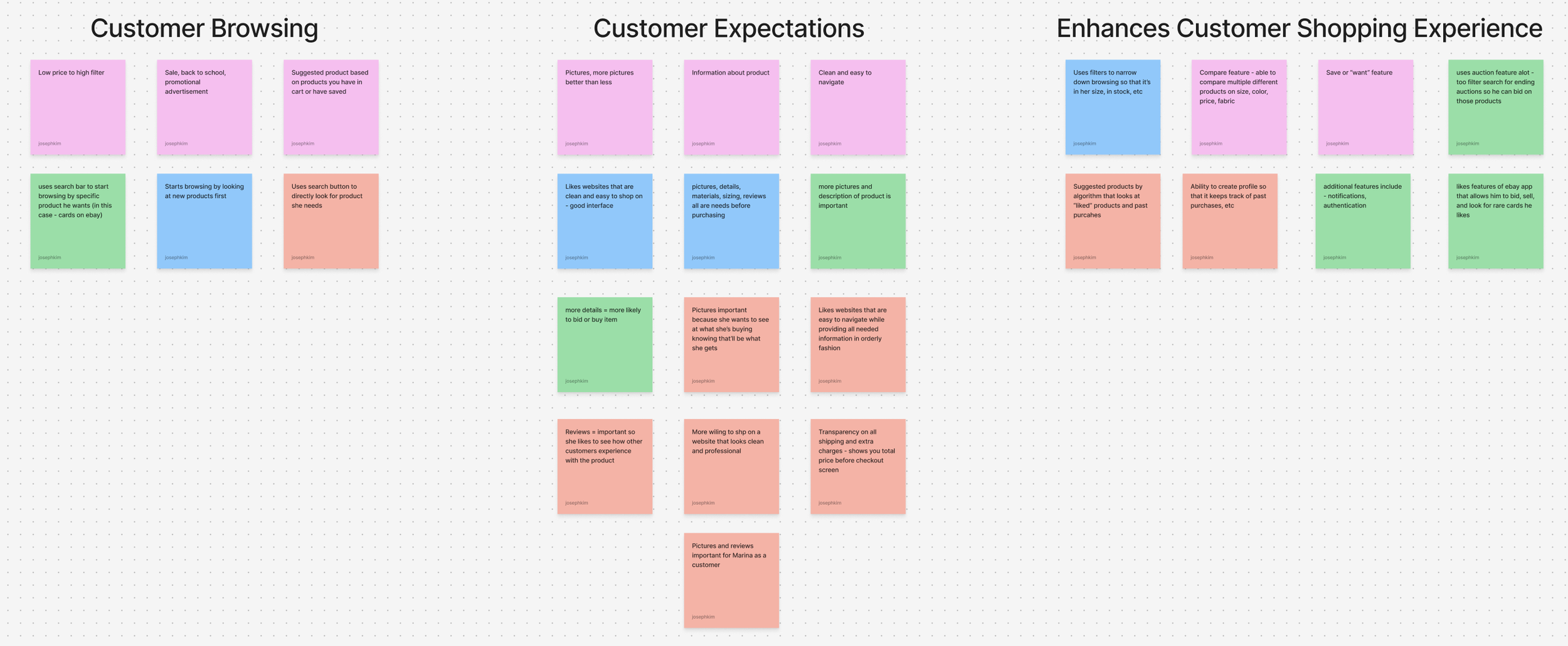
I asked each interviewee to go to their favorite e-commerce website and show me how they usually go about shopping
There were 2 main approaches observed
They start browsing by going through filters to have a narrowed down search of products that they would be interested in
Ie. men → pants → size 30 → browse
They go to their watchlist or previously liked product to see if it’s still available or on sale
Next, I asked what made each website their favorite
Answers ranged from features of website
Watchlist, notifications
Detailed information of product and lots of pictures
Sizing, reviews, materials
Easy to navigate websites
Algorithm applications that suggest other products similar to what they just looked at
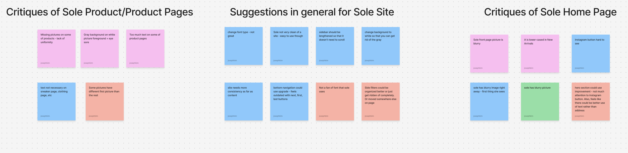
I proceeded to show each interviewee SoleSeattle’s website and asked them to give me their initial thoughts - good and bad
Blurry image gives off bad first impression
Hero section collectively was not liked by all interviewees - eye sore
Text might be better suited with something other than address and hours
Missing pictures on some shoes
Would rather like to see more pictures for shoes rather than sidebar
Gray background with white background of pictures not appealing
Bottom navigation could be converted to have arrows and not first, last, next, etc
Text on clothing and sneaker pages not necessary - not gonna read it
Overall, aesthetics of the website are not great but the website is usable and easy to navigate
Users need a smoother navigation experience.
Design Goals
Key Problem Areas
Users struggle to find specific products due to limited functionality.
Users want reliable information to confidently make purchase decisions.
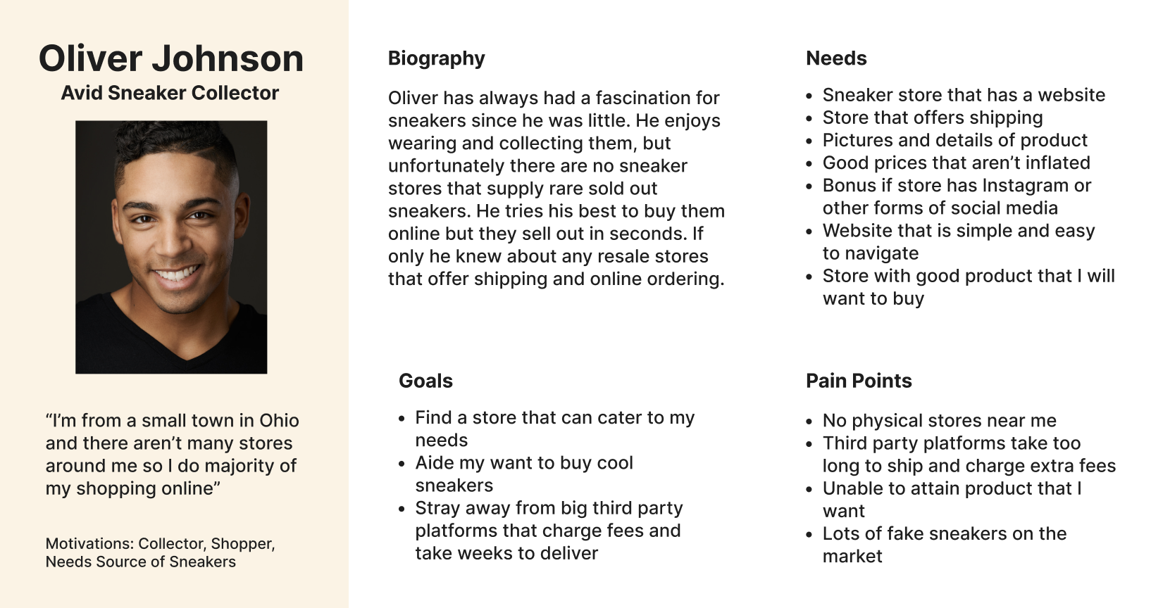
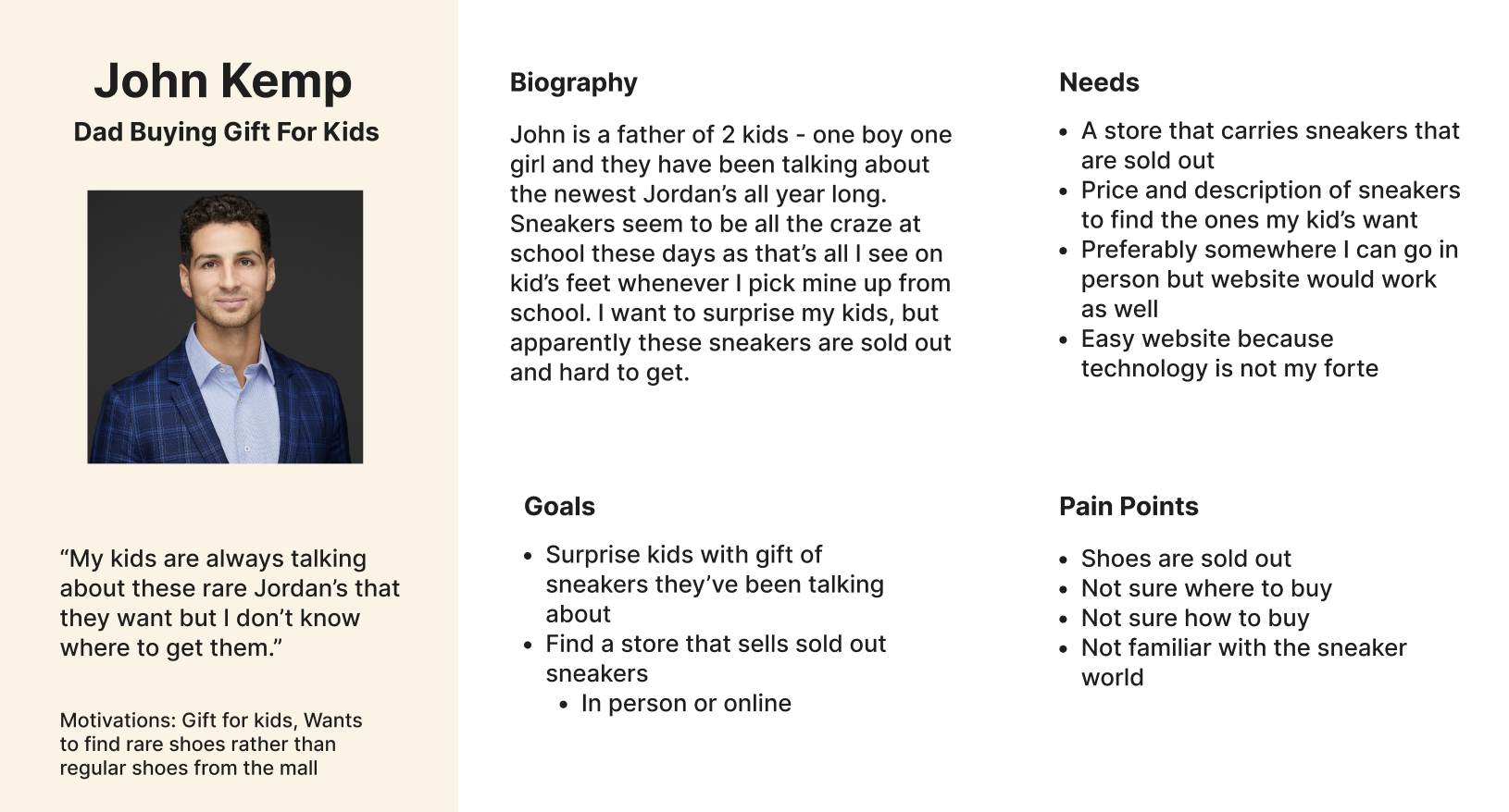
Whose problem am I solving?
Ideation: User Flow
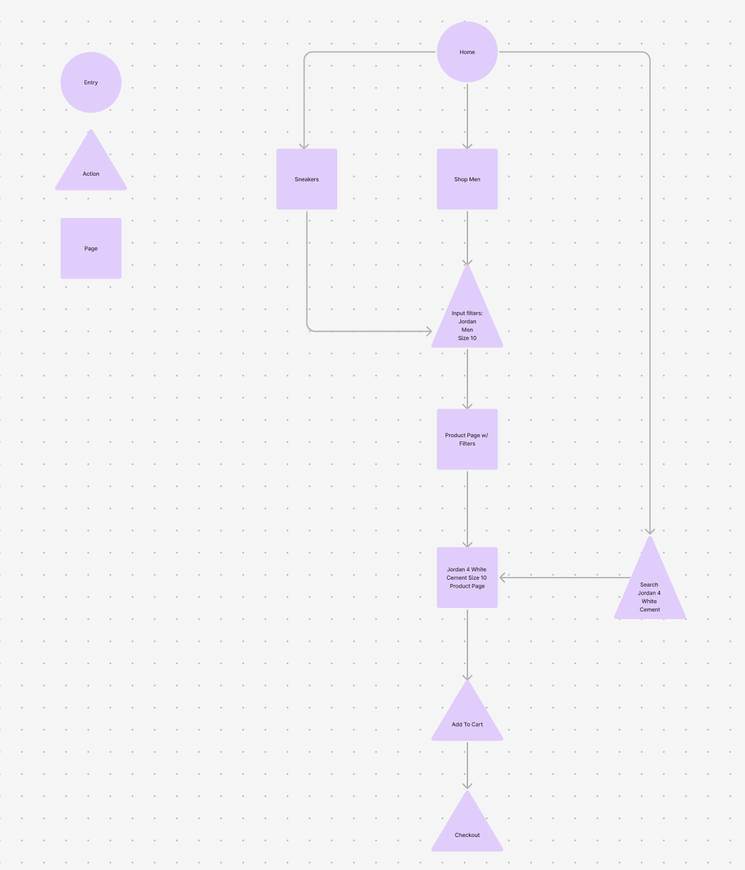
Goal:
Enable users to quickly find the right sneaker by improving product discovery through intuitive navigation and robust filtering.
Problem:
The existing flow made it difficult to browse and filter products, leading to unnecessary scrolling, confusion, and longer time spent searching.
User Flow Focus
Designed a streamlined browse-to-product flow centered on clarity and ease of use
Introduced clear category entry points (brand, model, size, price, condition)
Reduced friction by allowing users to filter and refine results at any stage
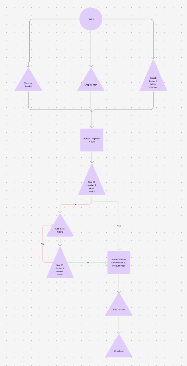
Key Improvements
Filters are persistent and easily adjustable without resetting the flow
Sorting and filtering work together to narrow results efficiently
Product cards surface essential info upfront to support faster decisions
Outcome
Users can move from landing page to product detail with fewer steps
Improved scannability and reduced cognitive load during browsing
Created a scalable flow that supports SoleSeattle’s growing inventory
Design
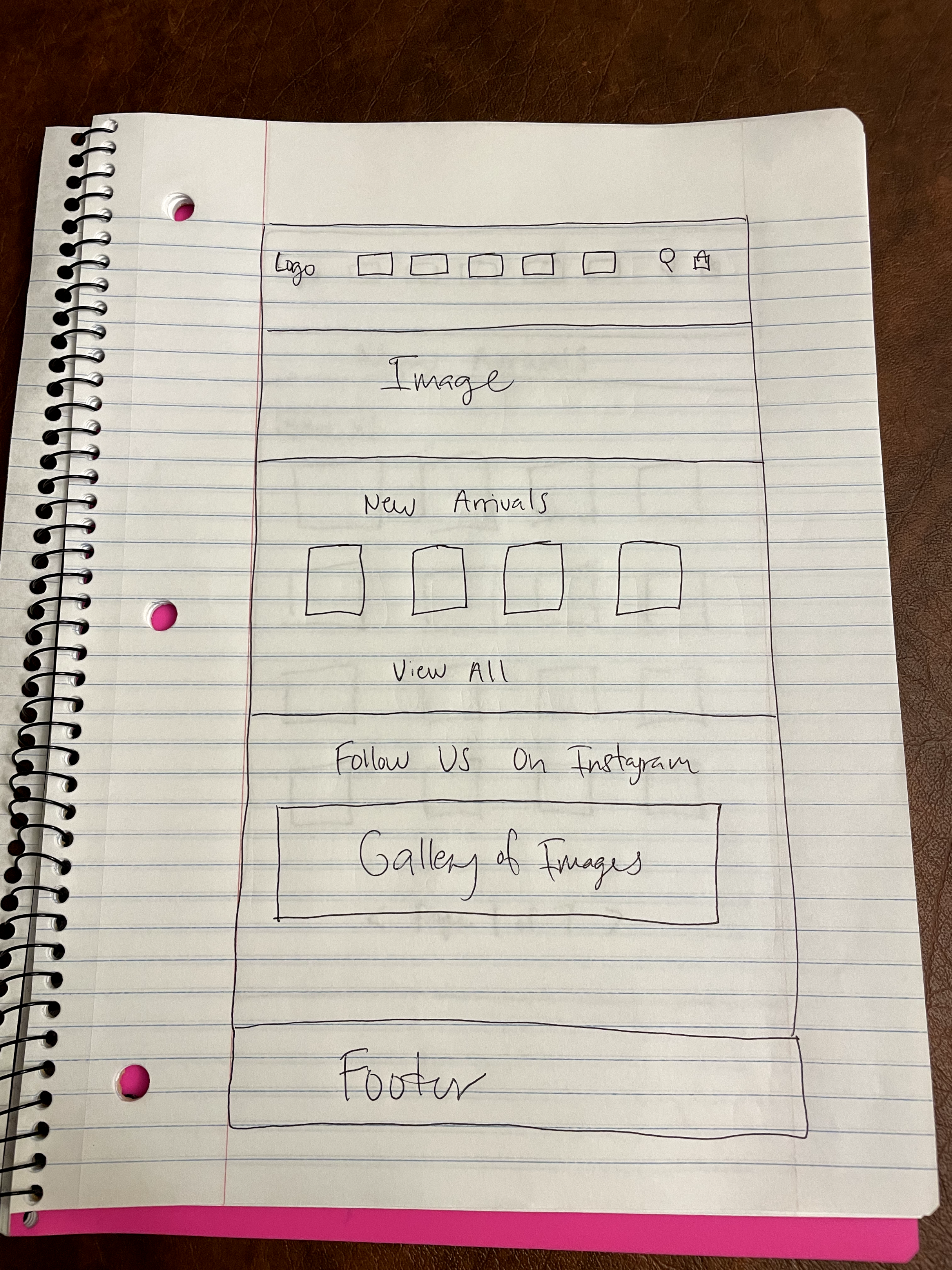
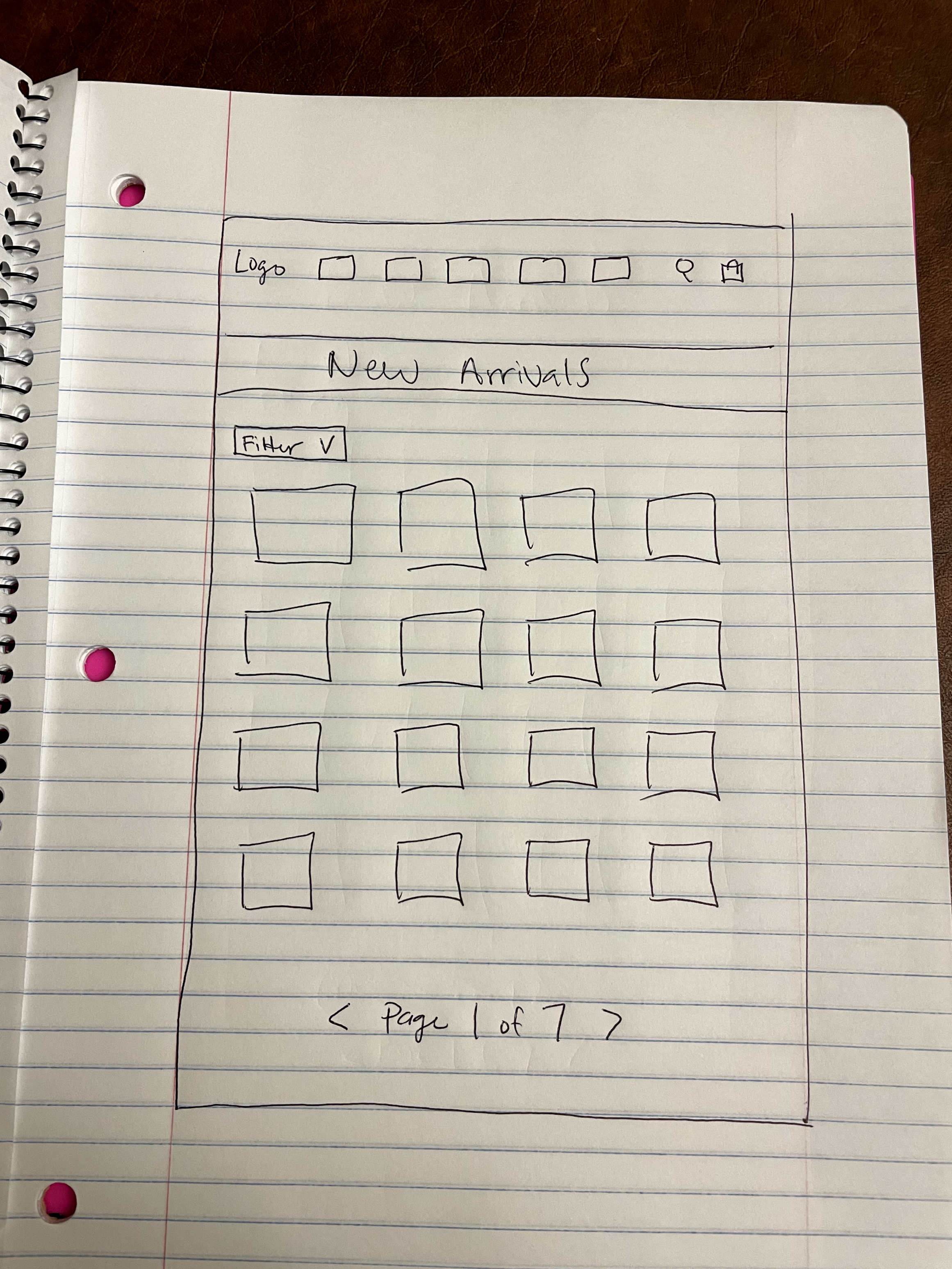
Low Fidelity Wireframes:
Lo-fi wireframes focused on ideating homepage clarity and enabling faster, more flexible product discovery through robust filtering.
Mid-Fi Wireframes:
Refine and enhance the existing SoleSeattle website by upgrading core layouts and interactions while preserving familiar patterns users already recognize
Focused on fixing visual elements
Stronger CTA
Ideating options on how to fix filters on existing website
During this process, I felt as if the home page lacked any true improvement so I decided to continue ideating new layouts
I liked the direction the product page was headed with the side filters
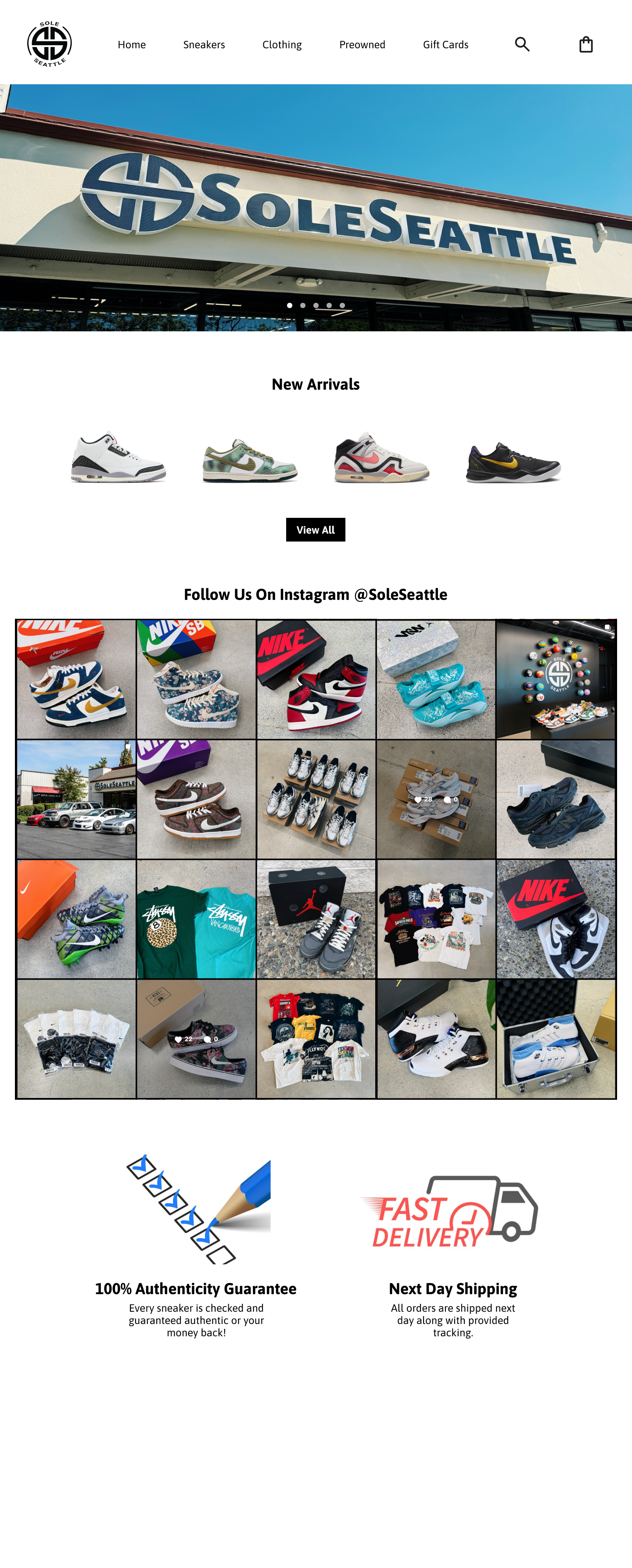
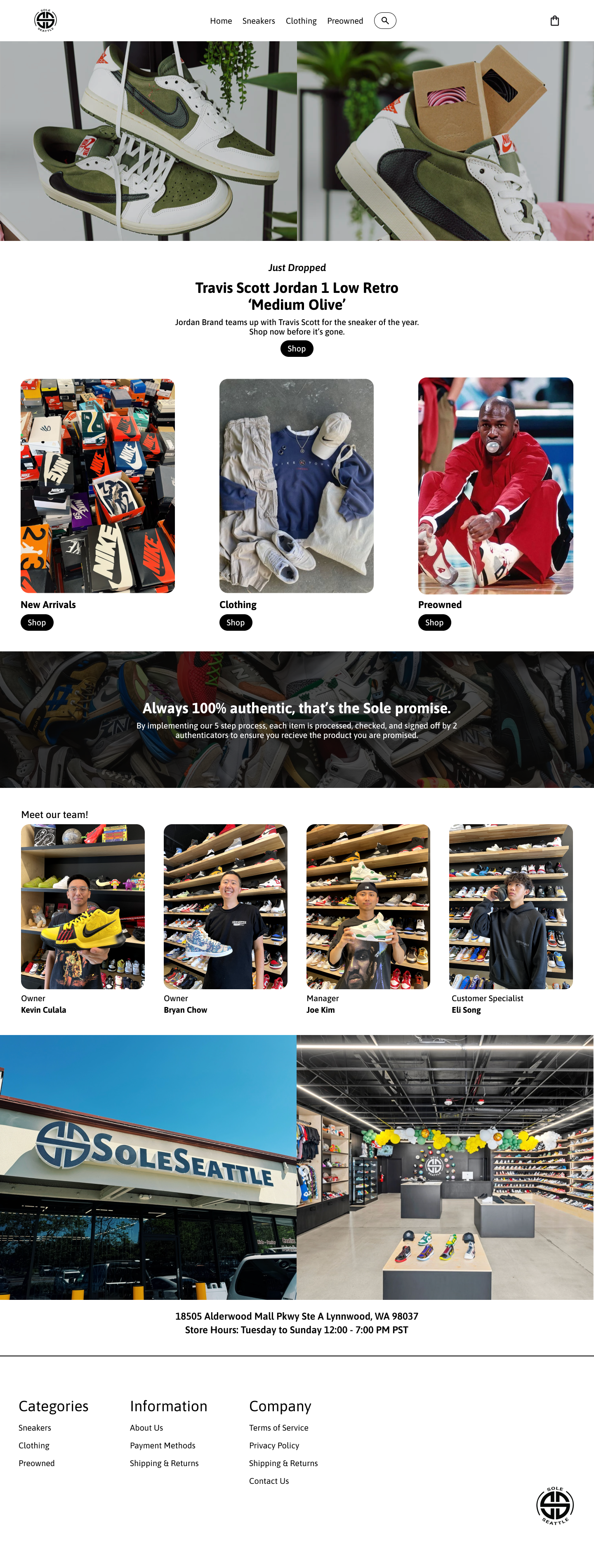
High-Fi Wireframes:
Deliver a prototype that modernizes SoleSeattle’s shopping experience while staying true to the brand and existing user behaviors.
Execution
Applied visual design, typography, and spacing to create a clean, modern interface
Elevated existing components rather than redesigning from scratch to maintain familiarity
Ensured consistency across homepage, product listings, and filtration interactions
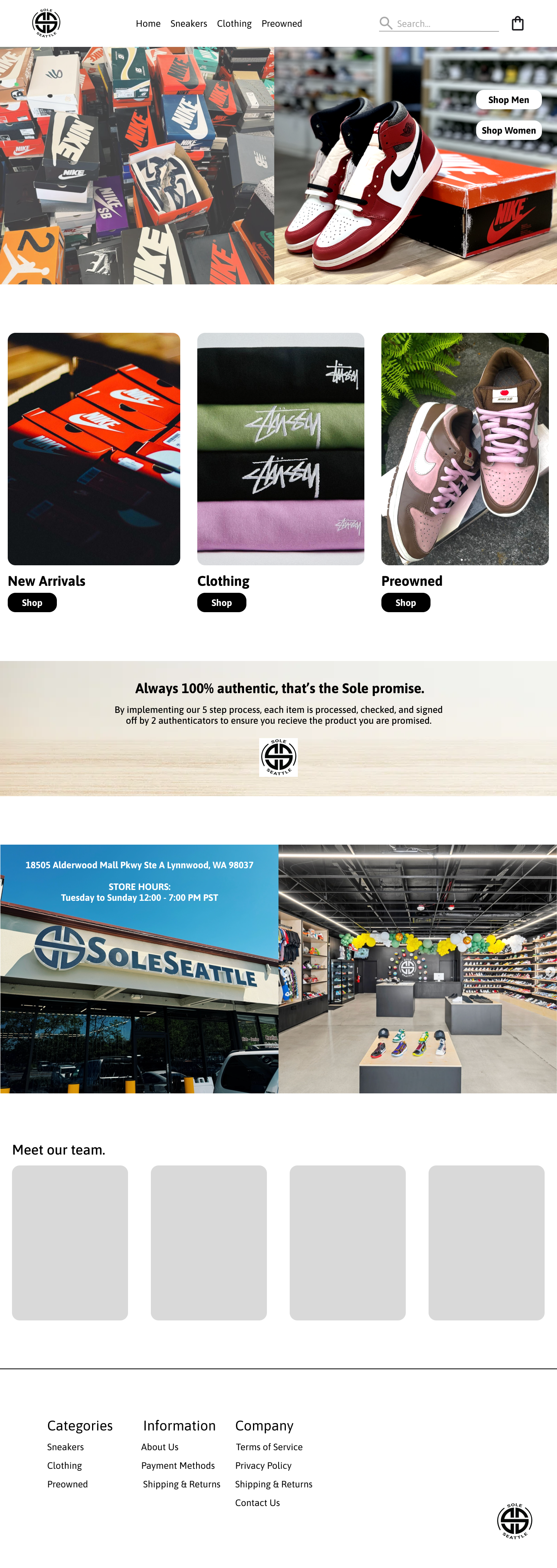
Homepage Experience
Strengthened visual hierarchy to guide users toward key shopping paths
Improved layout clarity and imagery to create a more engaging first impression
Reinforced brand credibility through cleaner visuals and consistent styling
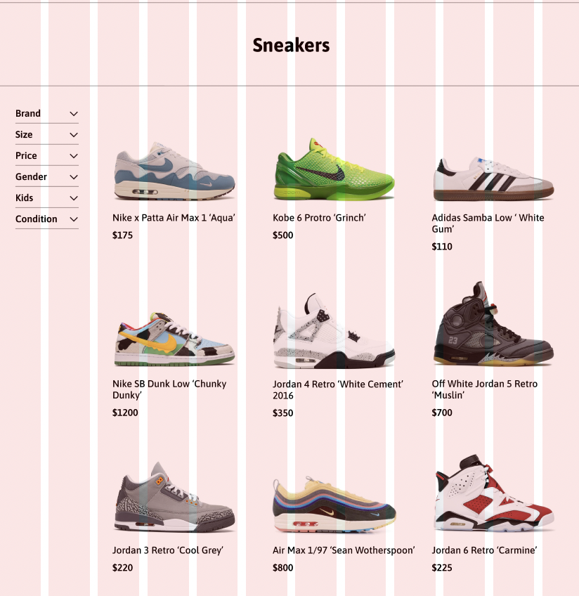
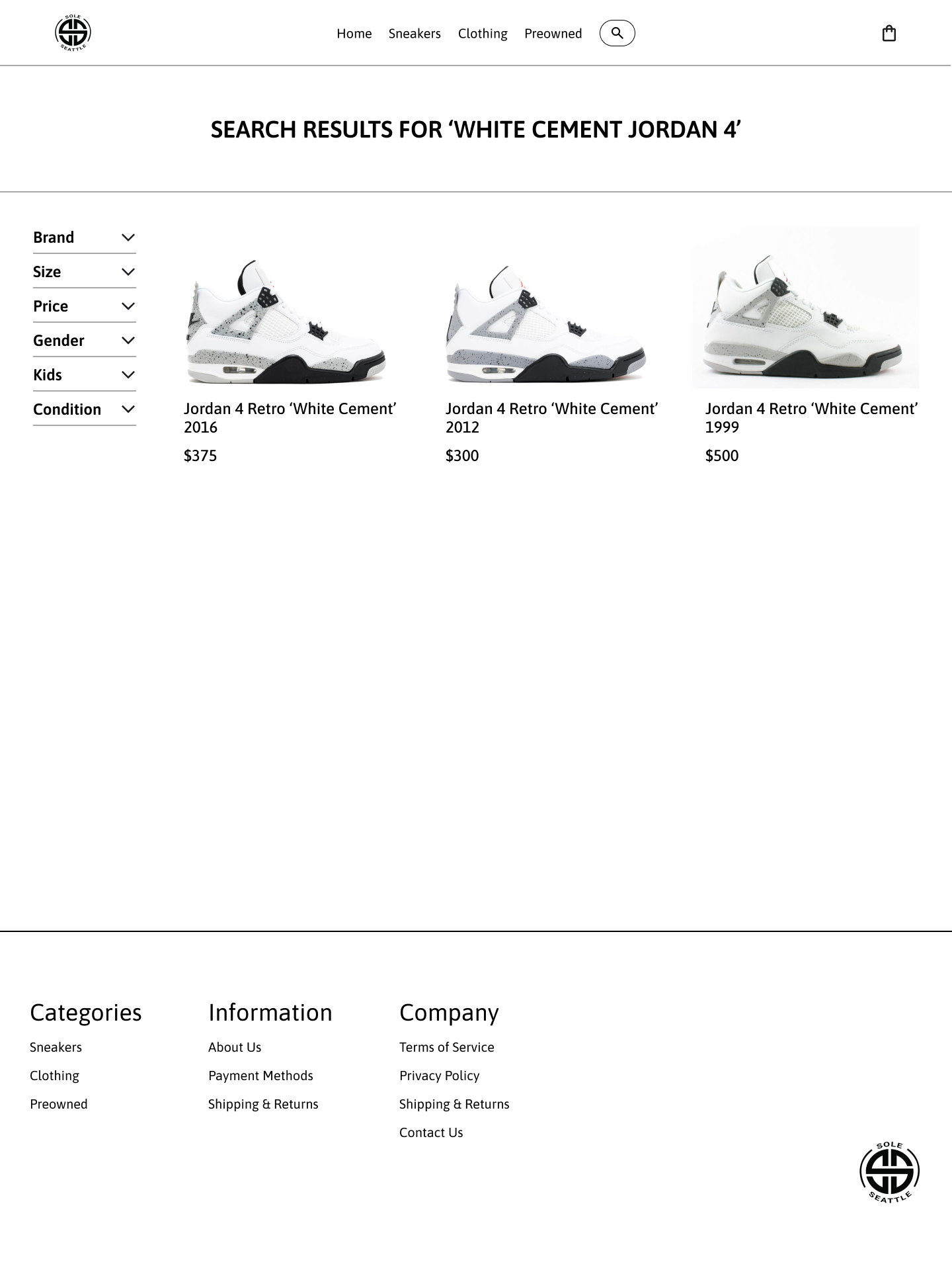
Product Discovery & Filtration
Delivered an intuitive, responsive filtering system that feels seamless and easy to adjust
Clearly surfaced essential product attributes to support faster decision-making
Reduced cognitive load by making refinement and comparison effortless
Outcome
Created a cohesive, user-friendly experience that feels modern without alienating existing users
Improved product findability and reduced time spent searching
Final prototype reflects a realistic, scalable solution ready for handoff or usability testing
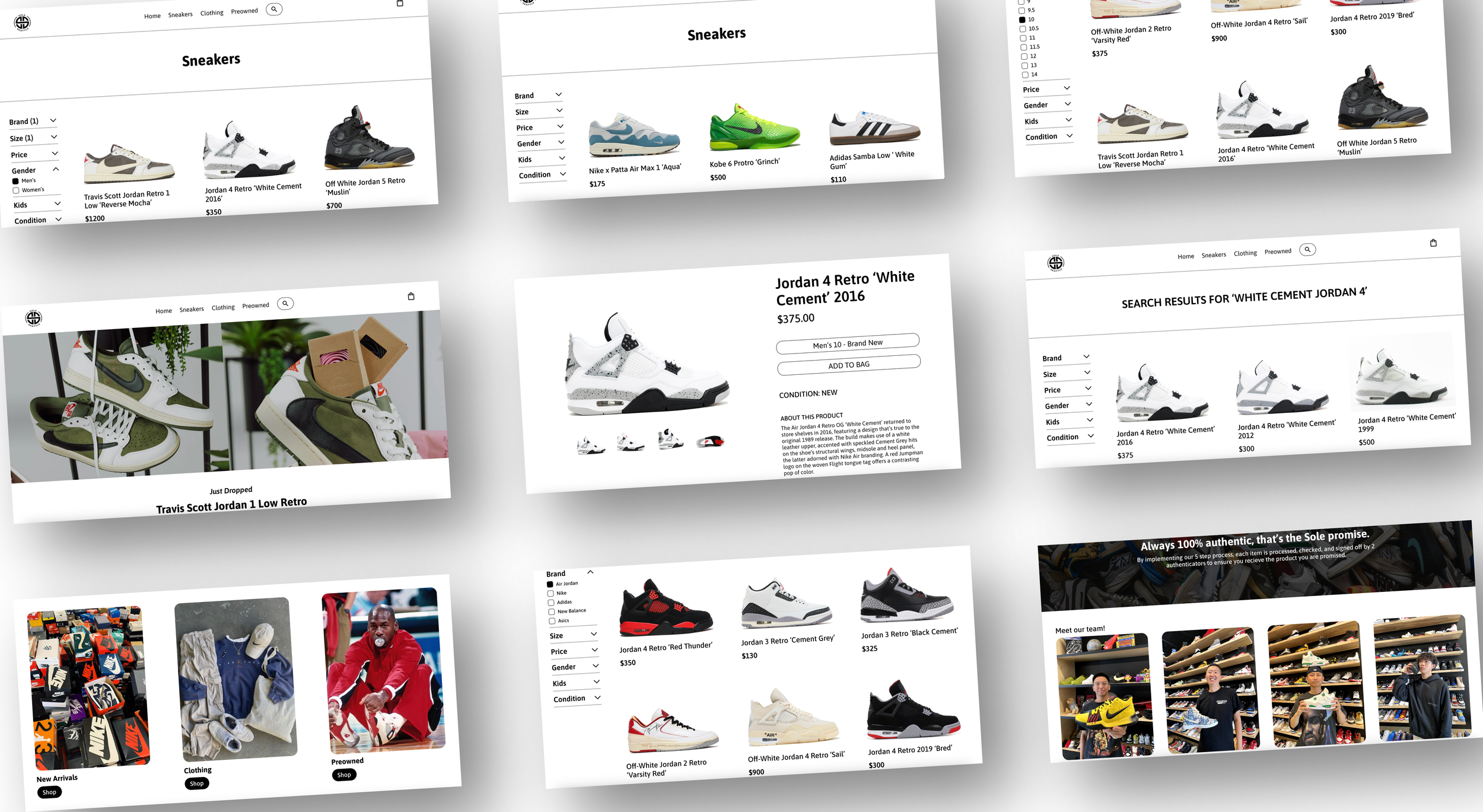
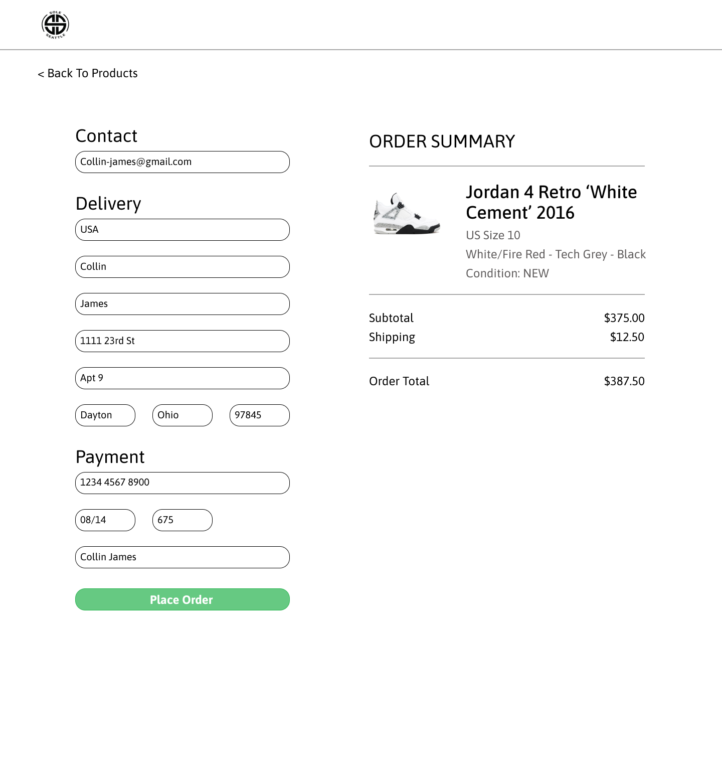
Home page → Search function → Checkout
Prototype
User Testing
Objective
To validate design improvements by observing users on the updated SoleSeattle prototype and comparing usability, flow, and visual clarity against the original website.
Testing focused on discoverability, filtering, product selection, and checkout completion.
Tasks Tested
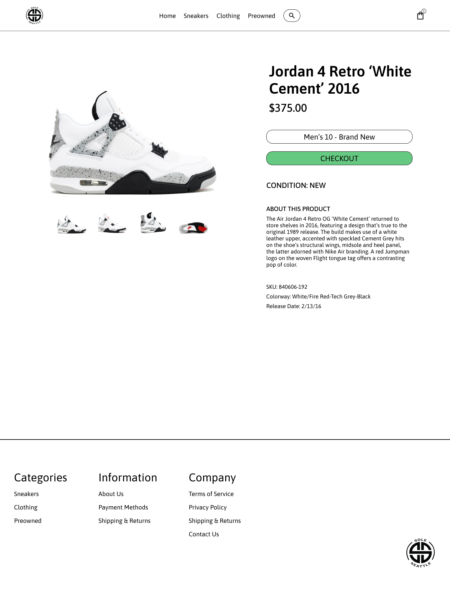
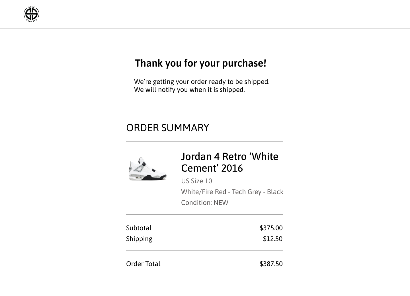
Task 1: Search Flow
Search for “Air Jordan 4 Retro White Cement 2016”
Add item to cart and proceed through checkout
Complete checkout until the confirmation screen
Task 2: Navigation + Filtering Flow
Navigate to Sneakers via top navigation
Apply filters:
Brand: Air Jordan
Size: 10
Gender: Men
Select Jordan 4 Retro White Cement 2016
Add item to cart and complete checkout
Reach order confirmation screen
Key Findings
Participants completed tasks faster and with fewer errors compared to the original website
Filtering system felt intuitive and efficient, with clear visual feedback
Improved product imagery increased confidence in product selection
User Feedback
Overall experience was described as cleaner, more modern, and easier to navigate
Visual hierarchy and imagery made the site feel more trustworthy and premium
Users preferred the redesigned flow over the original, citing reduced friction and clearer next steps
Conclusion
The re-test confirmed that the design iterations significantly improved usability, visual clarity, and task completion.
The updated prototype successfully addressed the main pain points identified in the original SoleSeattle website, validating the effectiveness of the design decisions.