A new feature that encourages users to enjoy virtual watch parties with their friends and family.
Project Overview
Netflix’s viewing experience is largely individual, making it difficult for users to watch and connect with friends remotely. In this project, I designed a native Watch Party feature within the Netflix ecosystem to enable real-time shared viewing, reduce reliance on third-party tools, and create a more social, engaging streaming experience.
Timeframe
February - April 2025Project Type
Adding a feature in Netflix appRole
Research, Interaction Design, Prototyping, TestingWhat are the product’s pain points?
Netflix users have access to hundreds of titles, which is great for variety, but this also causes decision fatigue. This creates friction for the user because they end up spending more time looking for content to watch.
What research backs this up?
I interviewed 5 Netflix users to understand and observe their experience with the app.
During these interviews, I asked qualitative questions to uncover common challenges, frustrations, and goals, revealing opportunities to improve their overall experience.
Research Objectives:
Determine streaming customers browsing habits
Learn how often they spend looking for content to watch
Learn if they use features on other platforms that helps algorithm
Ie. not interested feature, etc
Understand how relevant their recommendation algorithm is
Find out how often they are getting recommended titles or genres they are not interested in
Affinity Mapping:
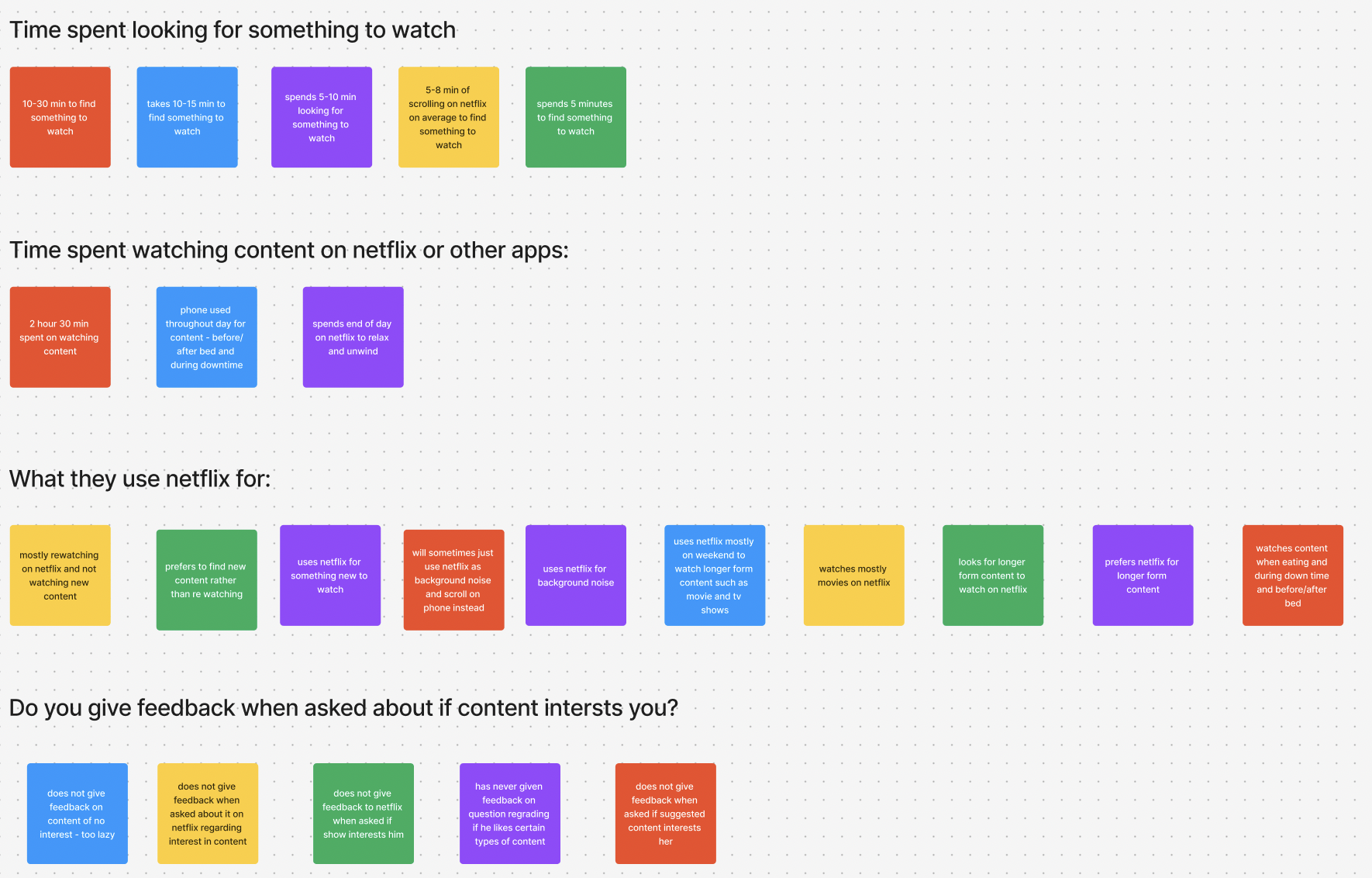
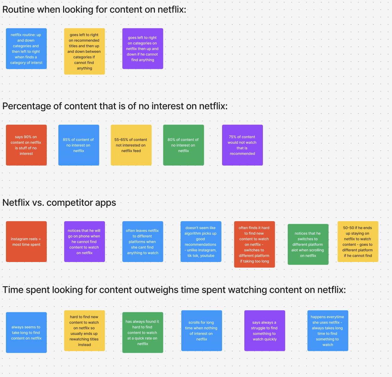
Findings/Takeaways
Time spent looking for content outweighs time spent watching content
Use Netflix to look for long form content
To watch while eating
To watch with friends
Leaves Netflix to competitor streaming when they can’t find titles to watch
Problem is not lack of titles, but too many titles that does not interest
How might we address theses pain points?
Research revealed that decision fatigue was a major blocker to starting a title, and that watching with friends helped reduce pressure and increase engagement.
Feature: Watch Party
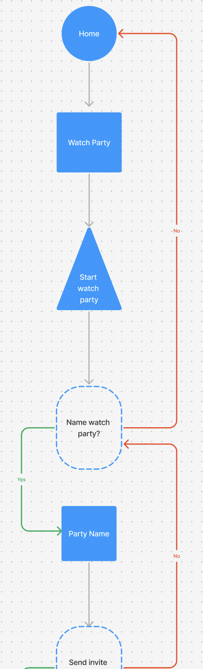
Description: This feature would allow netflix users to participate in a virtual movie night with their friends.
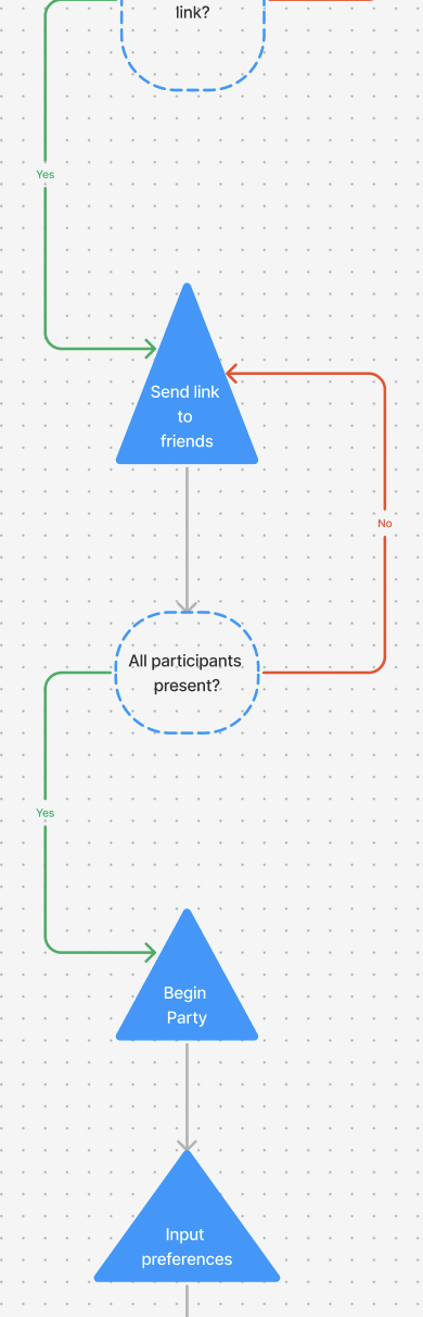
In “watch party” a user can host a watch party and invite other netflix users to join.
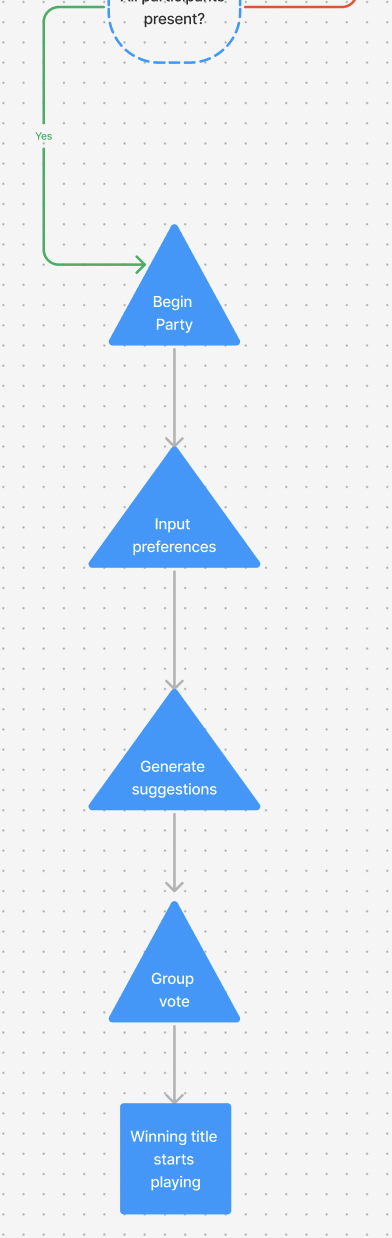
Everyone then inputs their preferences (genre, mood, duration) and the system will then generate titles based on the information.
This feature brings a new dynamic to Netflix in the form of virtual watch parties while streamlining the process of the group finding something to watch.
Ideation
My initial concept focused on reducing decision fatigue by automatically selecting a title for a group Watch Party.
However, as I explored this idea through user flows, I realized it introduced too much complexity
I decided to pivot and focus on creating a flow that focused on solely the group viewing experience
This allowed me to keep the first half of the user flow I created
I pivoted toward a simpler Watch Party experience that prioritized shared viewing over automated decision-making. This allowed users to maintain control over content selection while still reducing friction by making watching together easy and seamless.
Low-Fi Wireframes:
Design
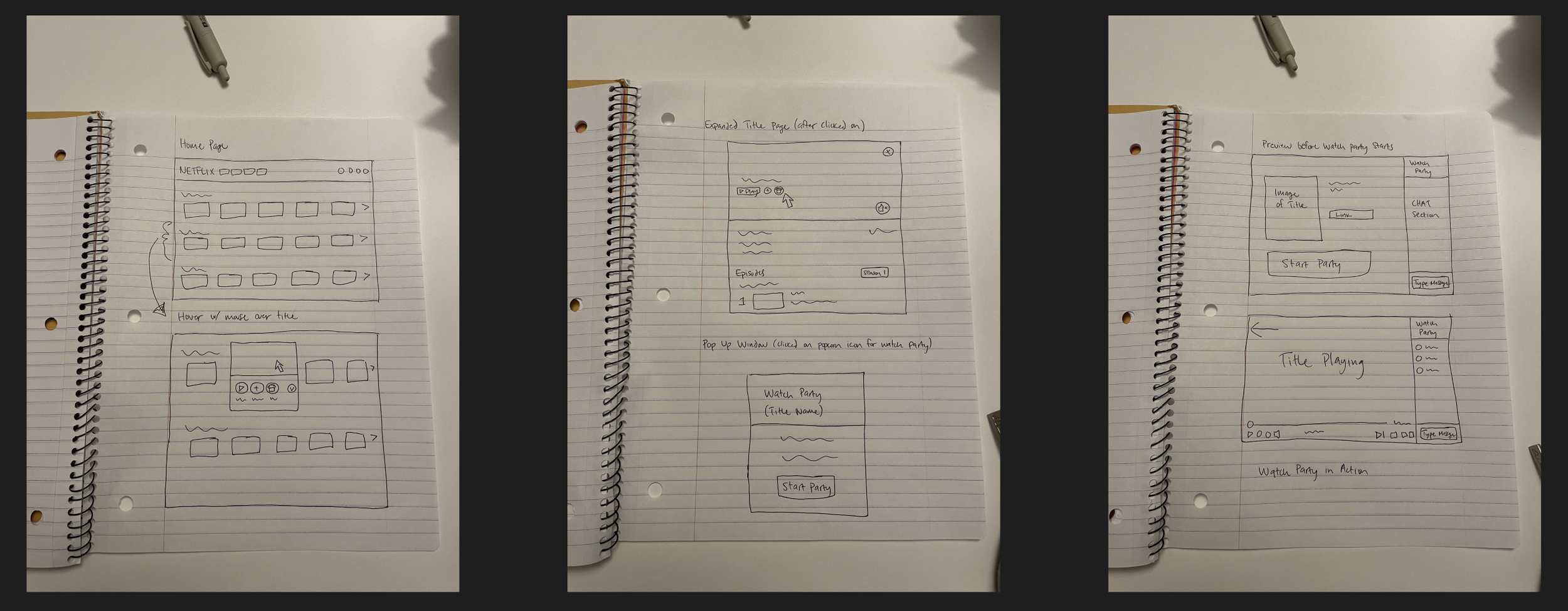
The main idea here was to find a way to naturally integrate the feature into the existing Netflix system
I thought it would be good to house the “Watch Party” feature with an image (ie. popcorn)
Netflix provides viewing options when you hover over a title
Mid-Fi Wireframes:
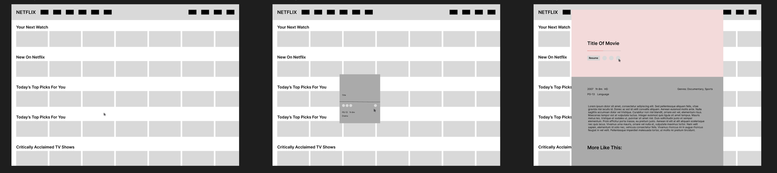
Here I started to design how the feature would look with Netflix’s existing system
I placed entry into the “Watch Party” feature in 2 locations
First, in the preview section of a title when you hover over it
Second, in the main title card before starting a title
Next, I visualized how the feature would look
Focus was on simplifying the user journey - making it easy to start or join a Watch Party without interrupting existing browsing or playback behaviors
I incorporated a chatbox so that people could interact with each other while watching
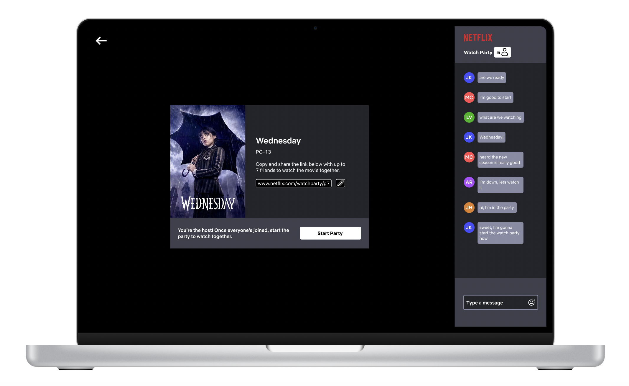
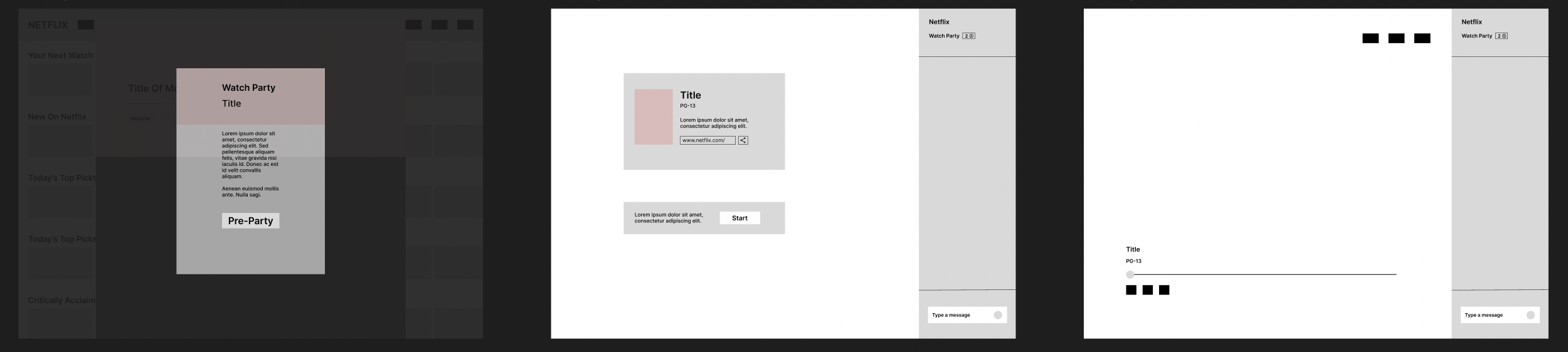
High-Fi Wireframes:
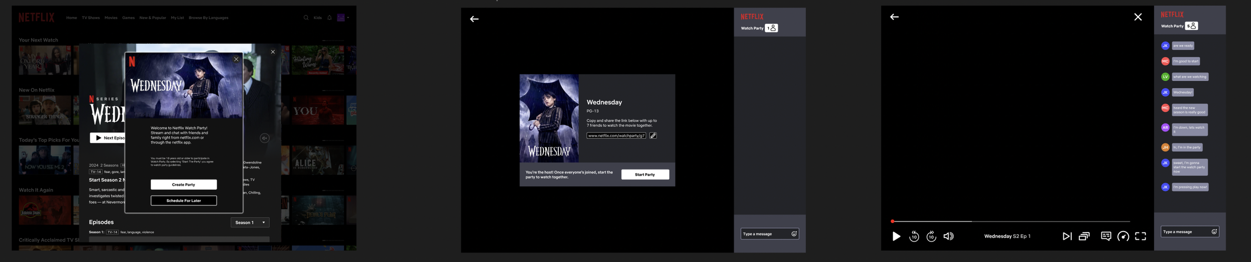
The high-fidelity wireframes bring the Watch Party feature to life within the Netflix ecosystem
Focusing on visual clarity, hierarchy, and flow
At this stage, the goal was to ensure the experience felt fully integrated with Netflix’s existing design system while clearly communicating shared viewing states and social interactions.
These screens refined key moments such as Watch Party creation, in-app invitations, synchronized playback, and participant presence.
By emphasizing familiar UI patterns and minimal visual friction, the final designs reinforce a seamless, social viewing experience that encourages users to spend less time setting up and more time watching together.
Testing
Objective: Test design of flow to determine if tasks are intuitive and simple to complete and receive feedback on areas to improve or change.
Participants: 5 participants
Method: Moderated Usability Testing (mix of in-person and via zoom)
Goal: Have participants successfully locate the watch party feature and start it with the show “Wednesday”.
Metrics: Ability to complete task, time of completion, rating of difficulty (1-5)
Task #1: Find the show “Wednesday” and start a watch party.
Follow-Up Questions:
On a scale of 1-5 (1 being easiest) how much difficulty did you have finding the watch party feature?
Is the icon easy to decipher as “watch party”?
Does the placement of the feature make sense?
Would it make sense for the feature to be present anywhere else?
Is there anything you would change or improve?
Results:
Average answer for difficulty was 2
Biggest complaint was that the “popcorn” feature was not obvious enough
Many interpreted it as a trash can
All participants agreed that the placement of feature made sense because you have other options like “add to my list” feature in same area
Unanimously, icon was the biggest pain point in the test
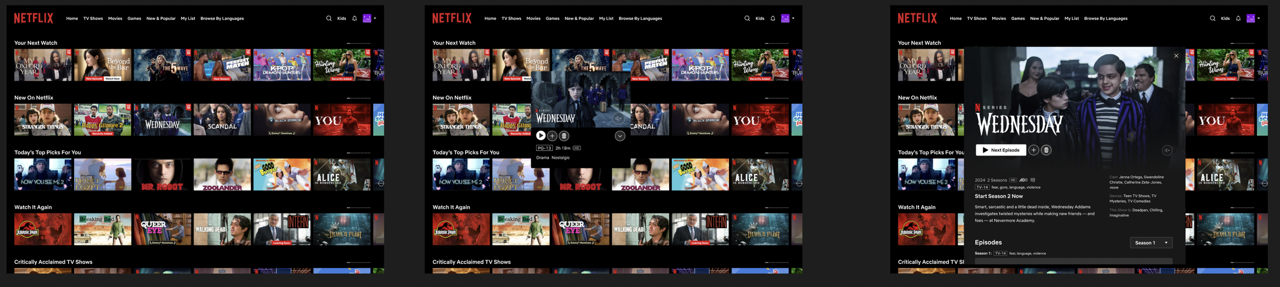
Final Prototype
Conclusion/Takeaways
This project reinforced the importance of staying flexible throughout the design process and allowing research insights to guide decision-making. While the initial concept aimed to reduce decision fatigue through automation, iterative exploration revealed that simplicity and user control were more effective in creating a meaningful shared experience.
Key takeaways from this project include:
Designing for real-world constraints by simplifying complex ideas into focused, usable solutions
Learning when to pivot confidently based on usability and feasibility
Balancing user needs and business value by increasing engagement without adding friction
Strengthening my ability to design within an existing product ecosystem while respecting established patterns
Overall, this project sharpened my product thinking and reinforced that strong UX outcomes often come from knowing what to remove—not what to add.