
LinkUp
LinkUp was designed to solve the everyday friction of planning and coordinating social plans.
By reducing back-and-forth communication and visualizing availability in a simple, intuitive way, LinkUp helps users spend less time coordinating.
Role
Research, Interaction Design, Prototyping, Testing
Time Frame
11/15/25 - 01/25/26
Project Type
End to End App Creation
Understanding The Problem
Many people struggle to align schedules across multiple platforms, leading to missed plans, long message threads, and last-minute cancellations
LinkUp centralizes availability, events, and invitations into one shared space, making it easier for individuals and groups to connect and commit to plans with confidence.
Why Is The Problem Important?
Coordination fatigue is a hidden pain point in everyday life.
Users rely on fragmented tools like group chats and calendars that weren’t designed for collaborative planning, resulting in confusion and disengagement.
UX Research
Methods:
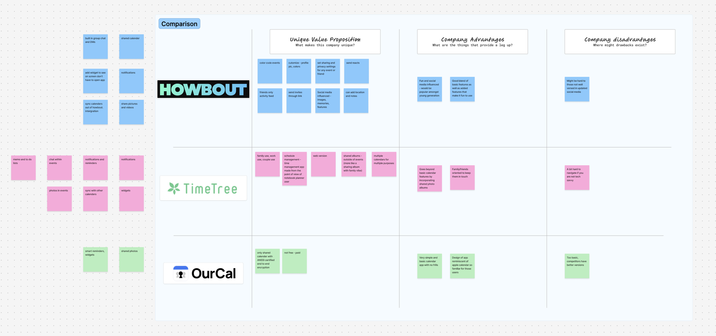
Competitive Research
5 In person interviews
Participants
Ages ranged from 18 - 47
3 females, 2 males
All reported to make plans on a weekly basis
Interview Questions Examples:
If you want to make plans with someone, how do you initiate that conversation? Text, group chat, social media, or something else?
How many days or weeks in advance do you reach out to someone to make plans?
How long does it take to find a time that works for everyone?
What typically causes plans to fail — scheduling conflicts, people forgetting, lack of follow-up, etc.?
If you could change one thing about how you make plans with friends, what would it be?
What makes a hangout worth the effort of planning?
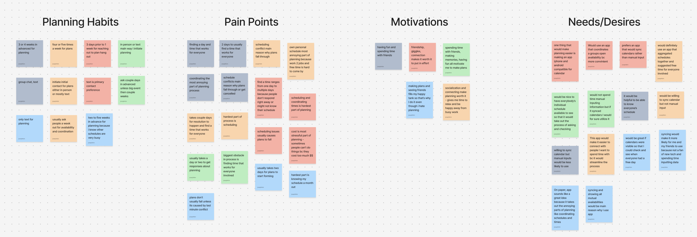
Findings:
Plans made during the week ranged from 1 time to 4 or 5 times a week amongst
Majority of interviewees claim to plan weeks in advance for hang out
And that it usually takes at least a couple days to finalize a date that works for all people involved
Pain Points:
Planning is hard to do because logistically it takes a long time for coordination between everyone involved
Needs/Desires:
An app or place where calendars of involved parties can be viewed
Easy way to show days or times where schedules are free and available
Motivations:
Motivated to make plans because it brings them joy
Even though it is a painful process, people still do it because at the end of the day it is worth it to them to spend time with others
Whose Problem Am I Solving?
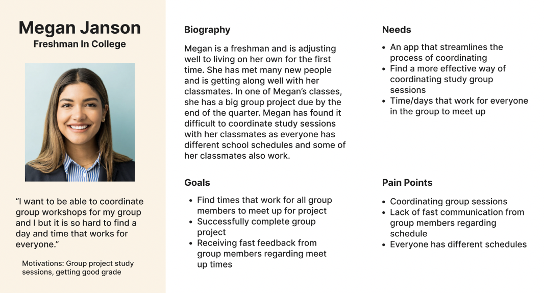
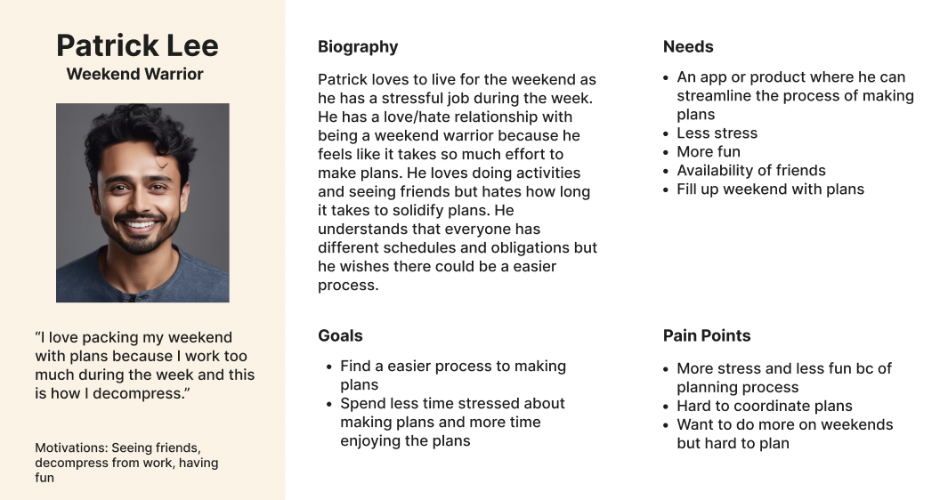
Users spend too much time trying to make plans
Design Goals
Users need a streamlined process of planning, checking individual schedules/availability, and coordinating a day that works
Users want a tool that helps reduce difficulty of planning
Ideation
Starting from a blank slate, I used the sitemap to define LinkUp’s information architecture before any visual design began.
I started by identifying the core user goals: creating plans, checking availability, and managing events, and organized the app’s structure around those needs

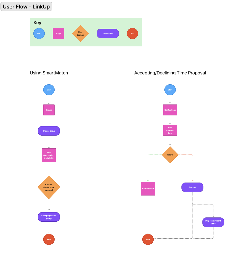
With the sitemap in place, I mapped user flows to visualize how users would move through LinkUp to complete key tasks.
These flows focused on critical actions like creating plans and responding to invites, ensuring each interaction felt intuitive and required minimal effort.
Defining user flows early helped identify friction points and validated the app’s structure before moving into wireframes.
Design
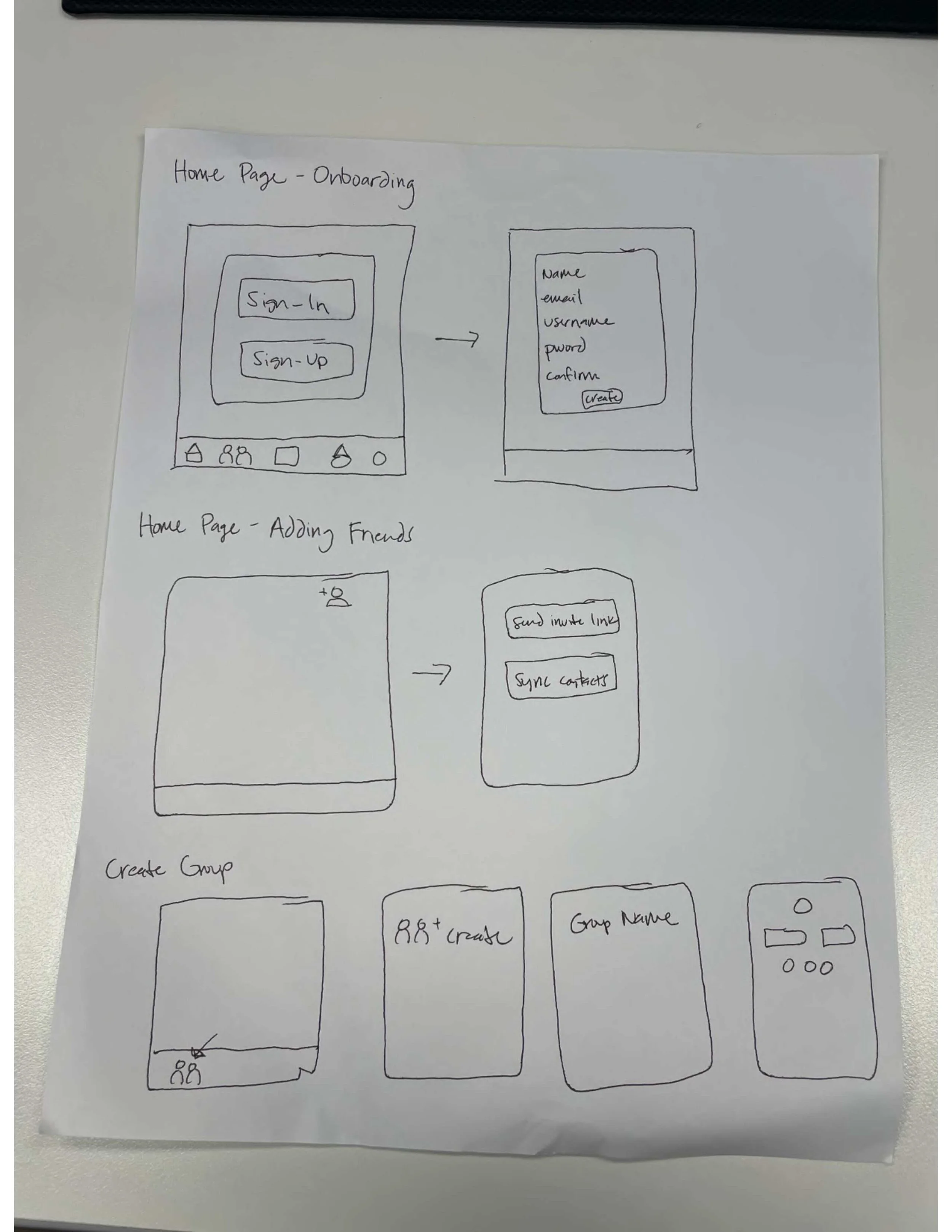
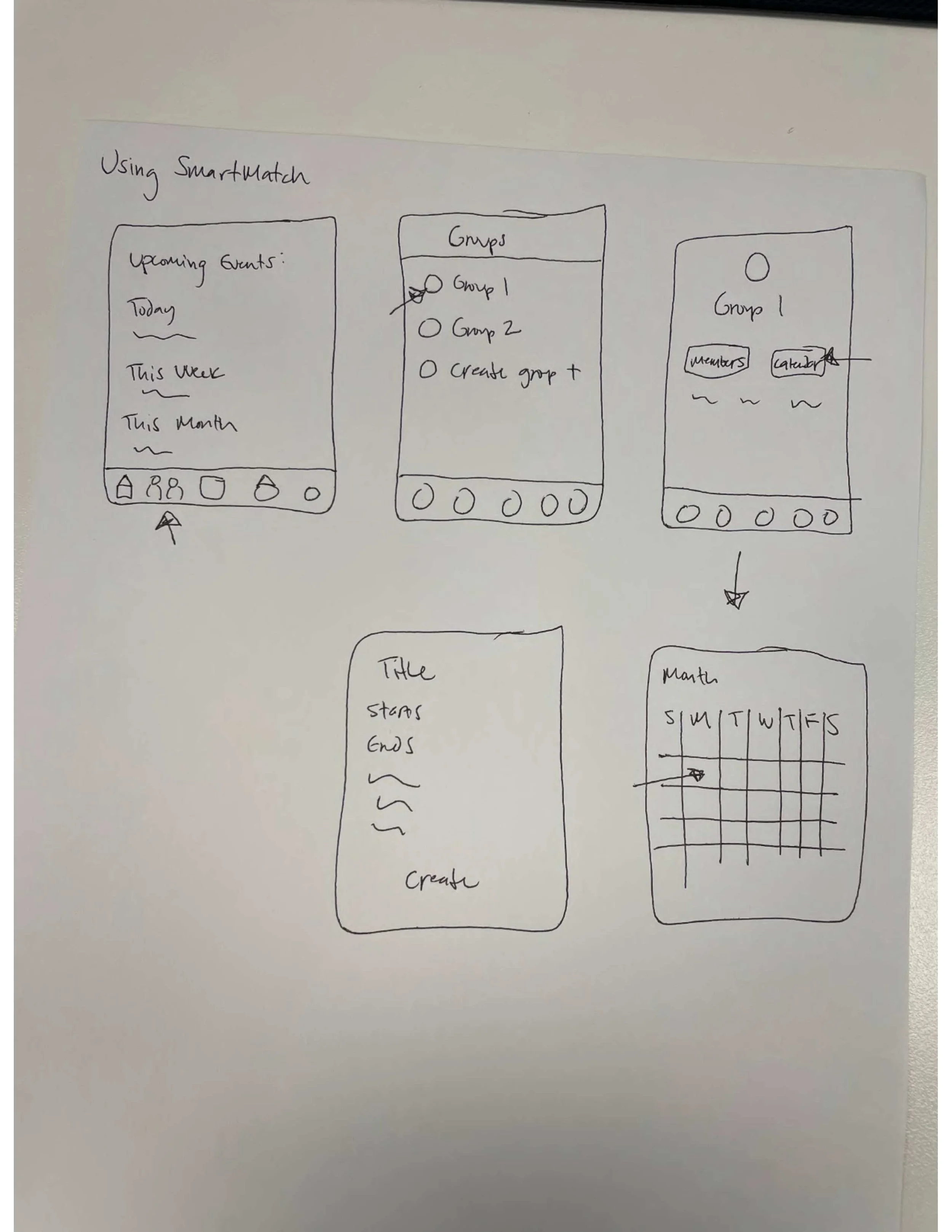
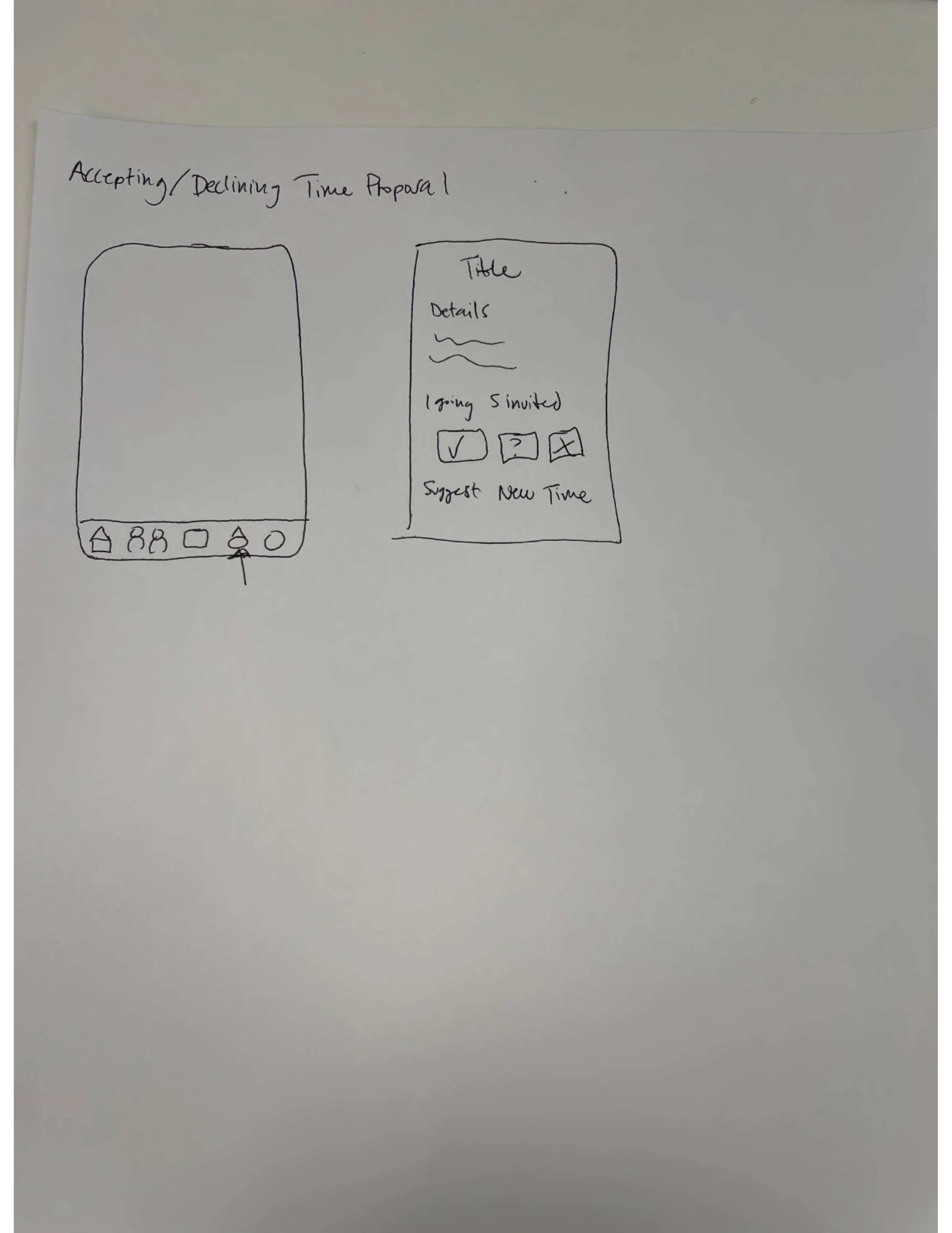
Low-Fidelity Wireframes
Low-fidelity wireframes were used to quickly explore layout, hierarchy, and core interactions.
At this stage Lo-fi wireframes focused on structure and flow, allowing quick validation of layout and interactions before visual design.
Mid-Fidelity Wireframes
This stage introduced clearer components, spacing, and interaction patterns while still remaining flexible for iteration.
Mid-fi wireframes helped bridge the gap between structure and visual design, ensuring usability before moving into high-fidelity execution.
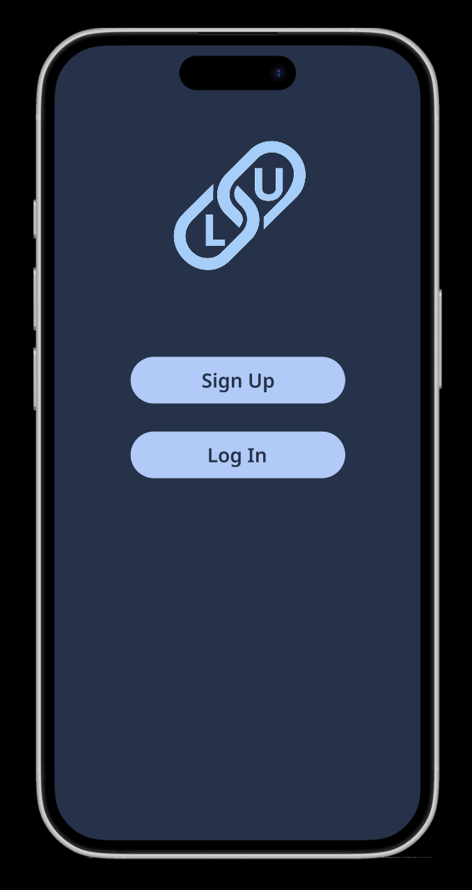
Visual Identity
The visual identity for LinkUp was intentionally minimal to keep the focus on functionality and connection.
The logo serves as a simple, recognizable mark that reflects bringing people together, while blue was selected as the primary color to communicate trust, stability, and clarity. This ensured the interface felt familiar and easy to navigate for first-time users.
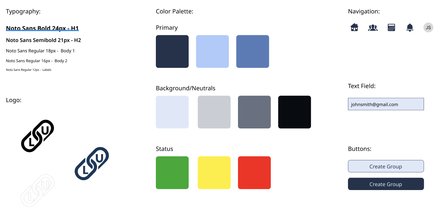
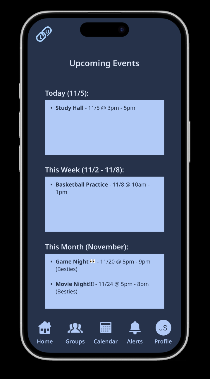
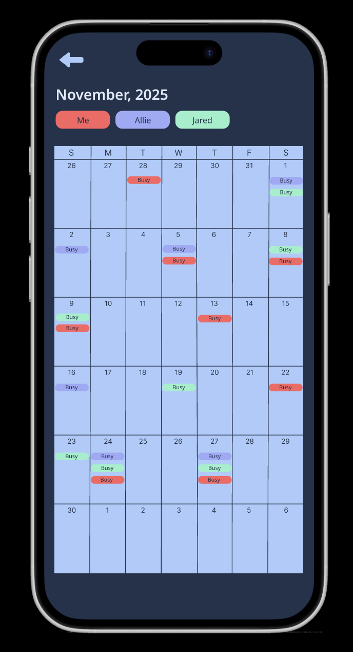
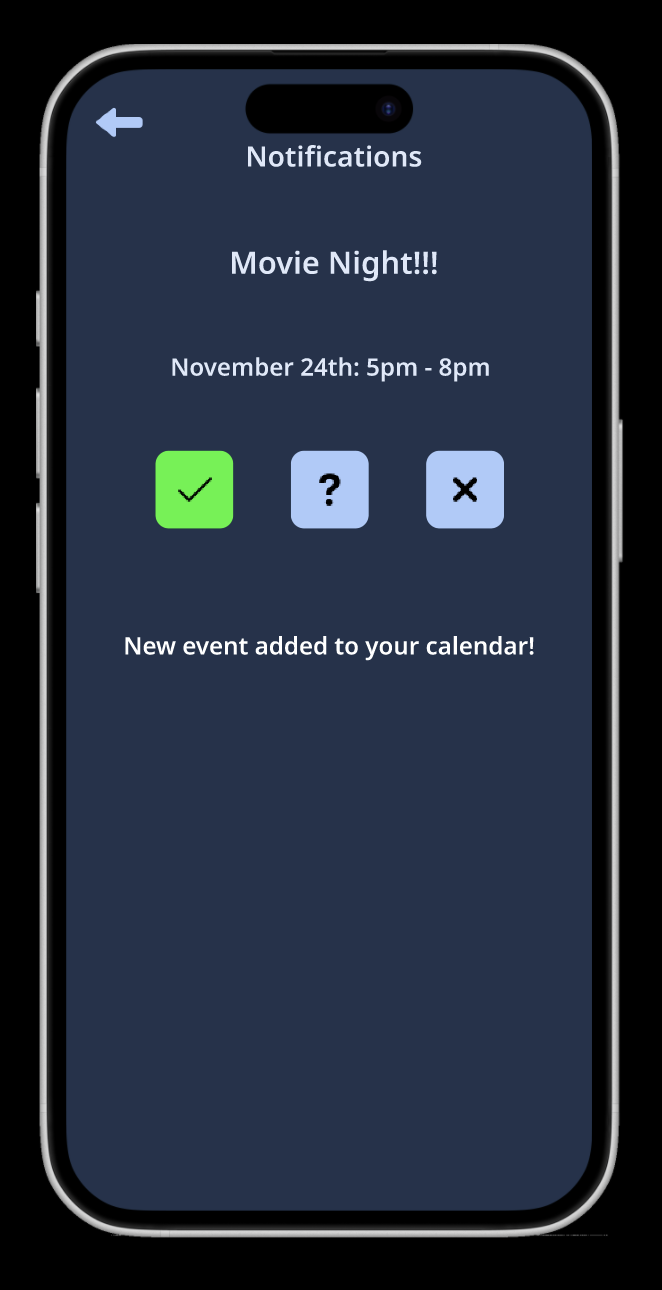
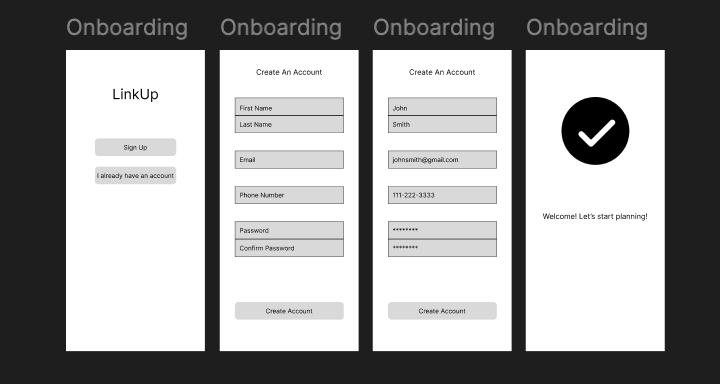
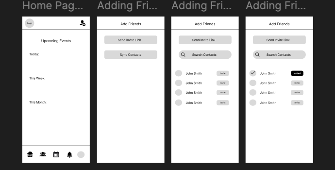
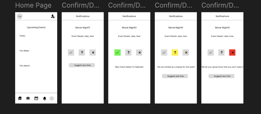
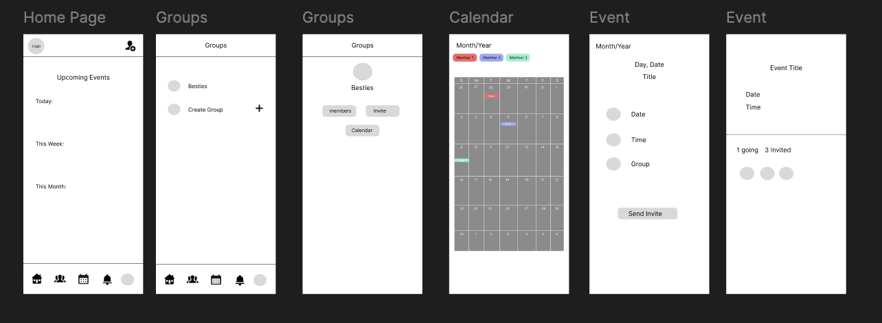
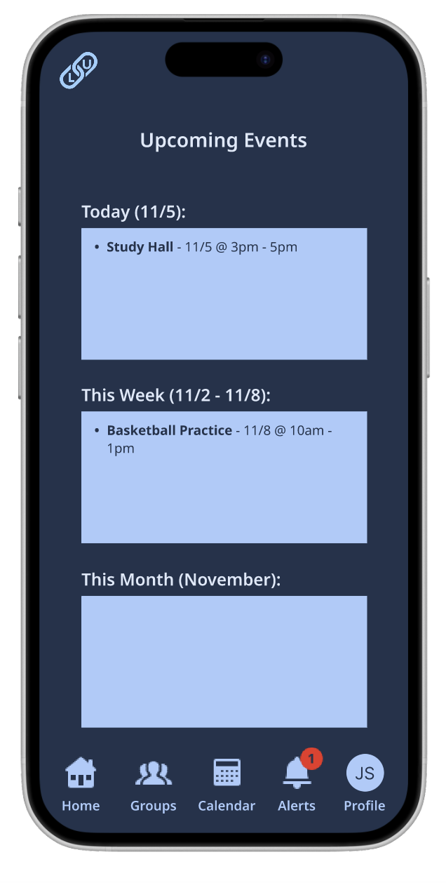
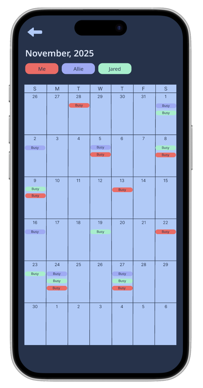
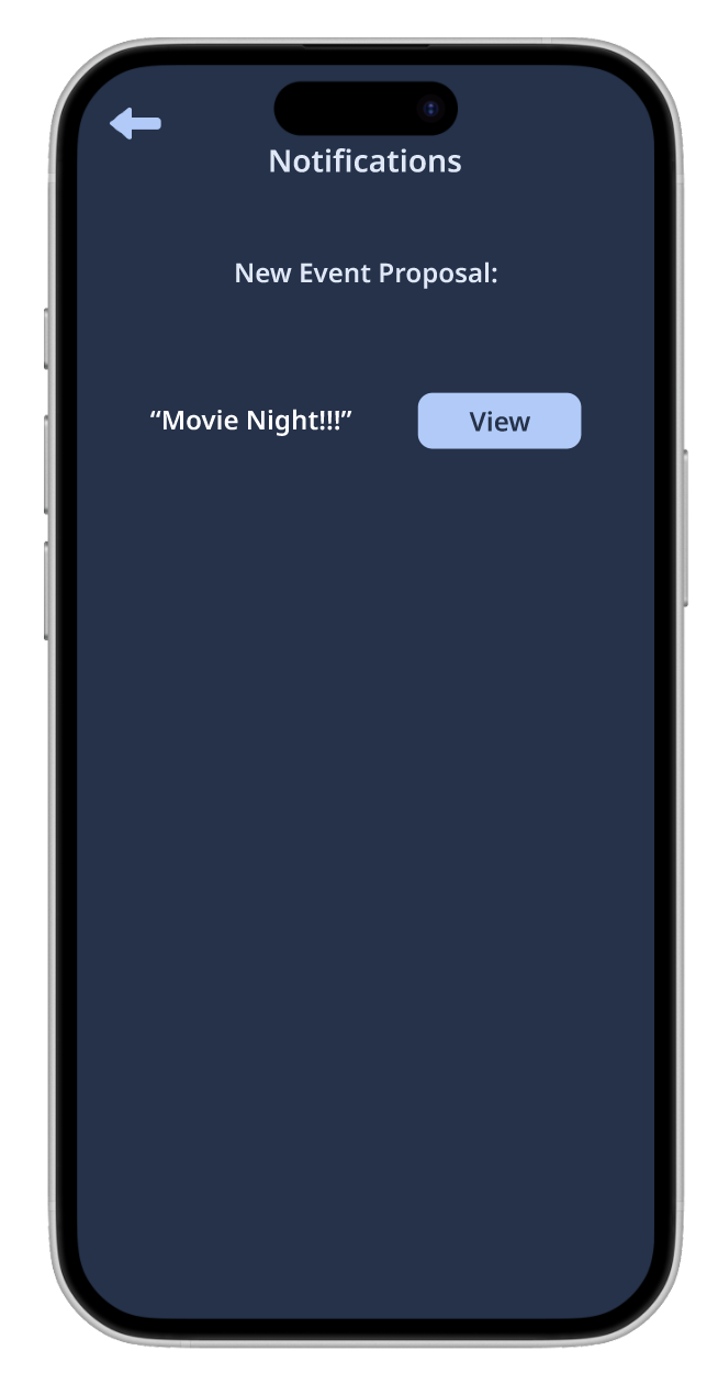
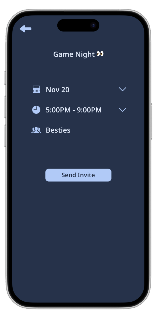
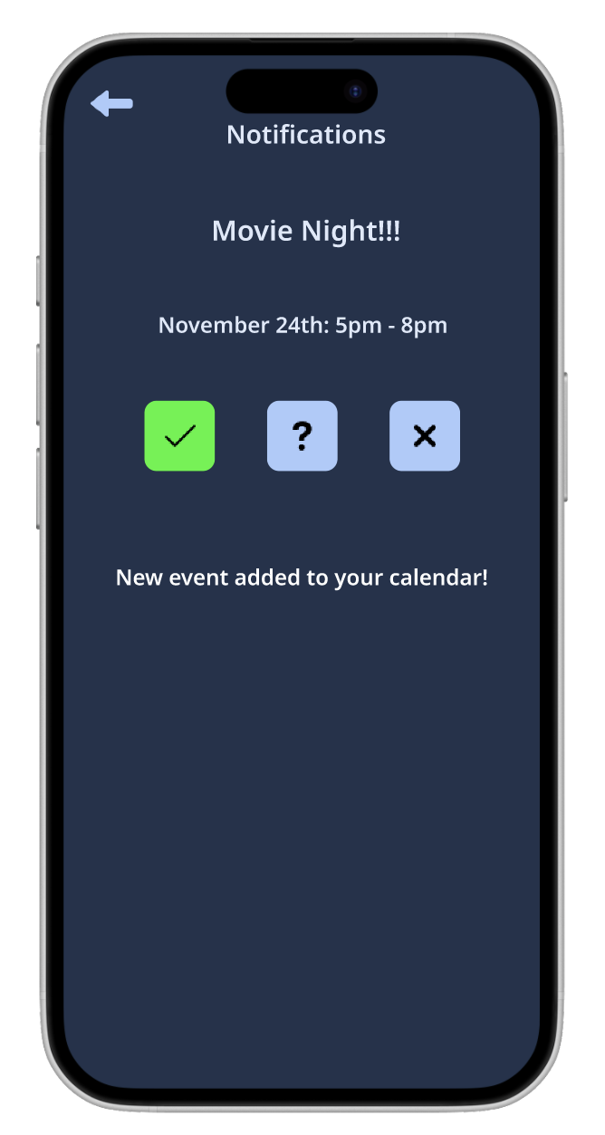
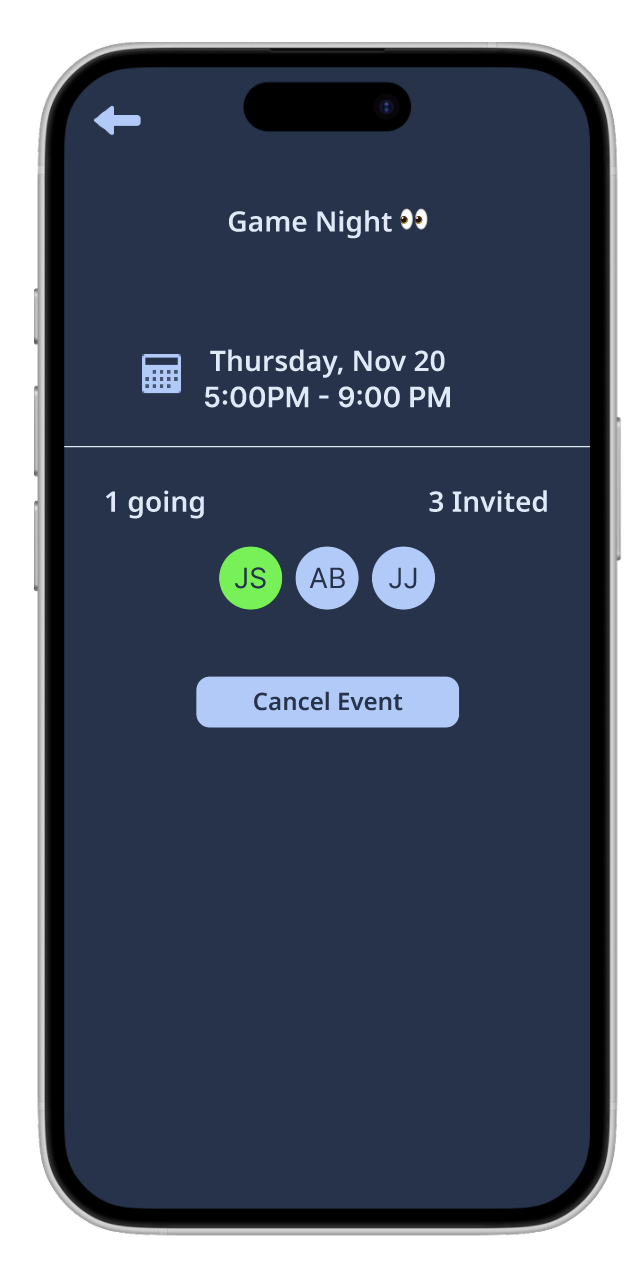
High-Fidelity Wireframes
After validating structure and flows through lo-fi and mid-fi wireframes, high-fidelity designs represented how LinkUp would exist in users’ hands.
This stage focused on visual clarity, consistency, and usability, ensuring the interface supported confident decision-making and easy coordination.
User Testing
Testing
Testing With High-Fi Prototype:
I tested the prototype with 5 users. High-fidelity user testing allowed me to evaluate how effectively LinkUp’s design supported real user behavior.
Tasks to perform:
Create Account
Create Group
Check notification and complete plan request
Use SmartMatch and create invite
Success metrics:
Time to complete tasks
Difficulty rating from 1 - 5 (1 being easy)
Ability to complete tasks without intervention
User Testing Findings
Participants rated the ability to complete the tasks as a score of 1 out of 5 (1 being easy and 5 being hard)
All participants confirmed that they would use an app with this concept
Mentioned would use for hang out, coordinating complicated events
Pain points mentioned for why they would use include: people text back slow, busy schedules so would be nice to be able to see collective availability without reaching out to person
Participants mention using similar features for making plans but not a dedicated app
Example: whatsapp has poll option
Majority still use text and back and forth for planning so having a streamlined process would be beneficial
Positives
Likes the calendar - color coded is cool to differentiate users
Good idea - would use an app like this in real life
Looks good, just need to make it more cohesive!
Conclusion and Takeaways
Project Summary
Designed LinkUp end-to-end from a blank slate, from information architecture to high-fidelity prototype.
Focused on reducing friction in social planning through clear structure, intuitive flows, and calm visual design.
Challenges
Defining scope without overcomplicating the experience.
Making early design decisions without existing constraints or data.
Balancing flexibility for group planning with simplicity for individual users.
What I Learned
Iteration is most effective when validated early and often.
What I’m Most Proud Of
Creating a cohesive, intuitive experience that solves a real everyday problem.